The Book Of Ember Series With Penguin Random House
Paul Sullivan • May 31, 2016
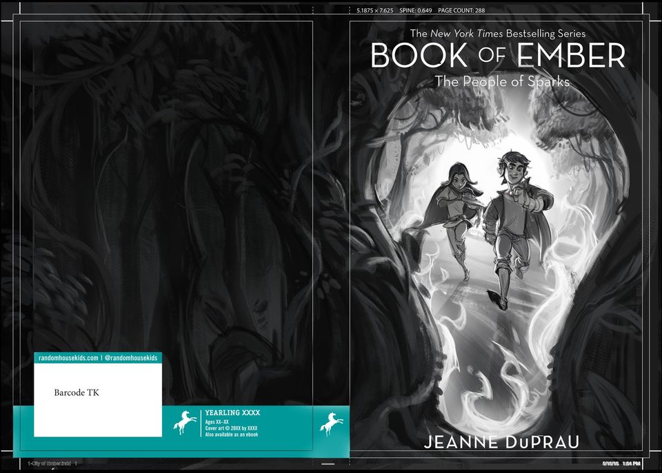
Process for a series of covers done for Penguin Random House book publishing.
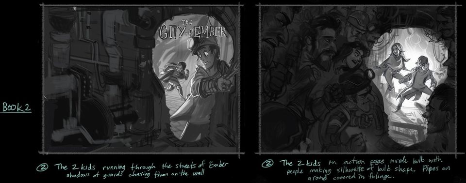
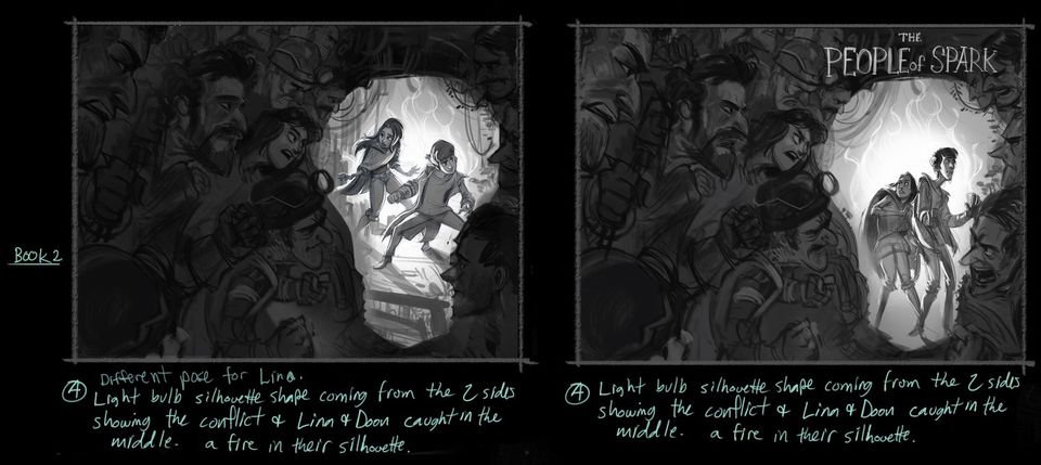
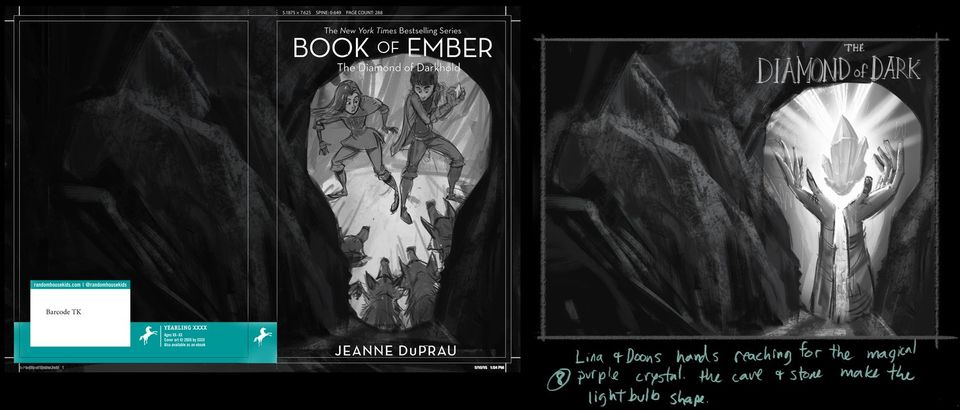
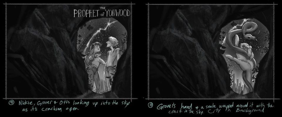
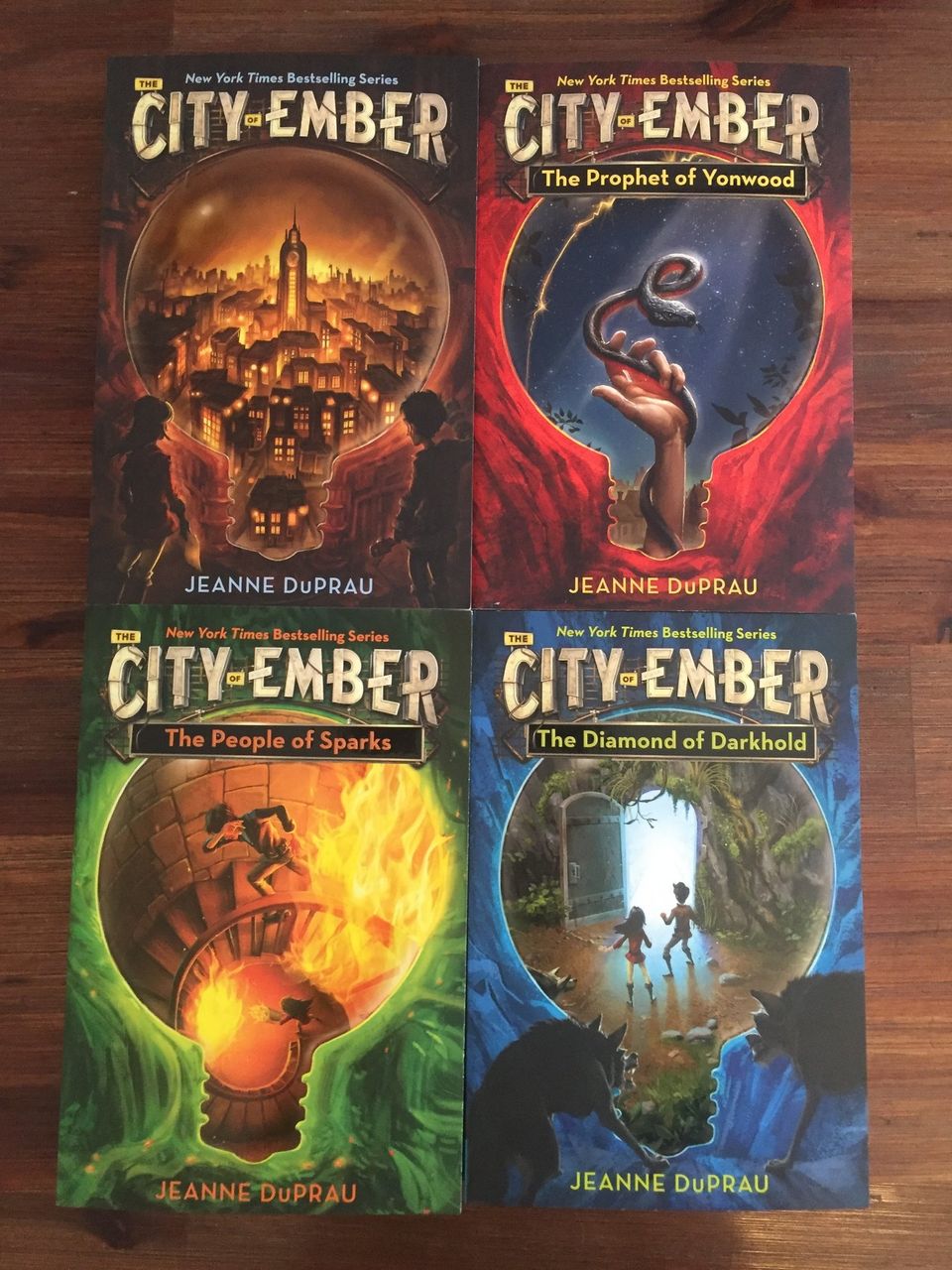
These book covers were done for a Penguin Random house re-packaging of the Book of Ember book series. Here are the final images front and back without text added. We had quite the journey with these babies to say the least, I can just say that I learned a lot about myself as a professional illustrator and hope to take that knowledge with me in future endeavors. I ended up with the above 4 finals as I promised them before I left on a long trip to Europe. While I was away they decided they changed their minds (again) and wanted to re-do books 2 and 3. At this point I was way beyond my time on this series and on to other projects, so we hired my awesome and amazingly talented buddy Bryan Lashelle to finish the new versions of books 2 and 3 while I art directed and did paintovers.
Below are some Roughs I did for the series. I did around 40 total but here are some of the most significant and some I personally like better than the final direction.
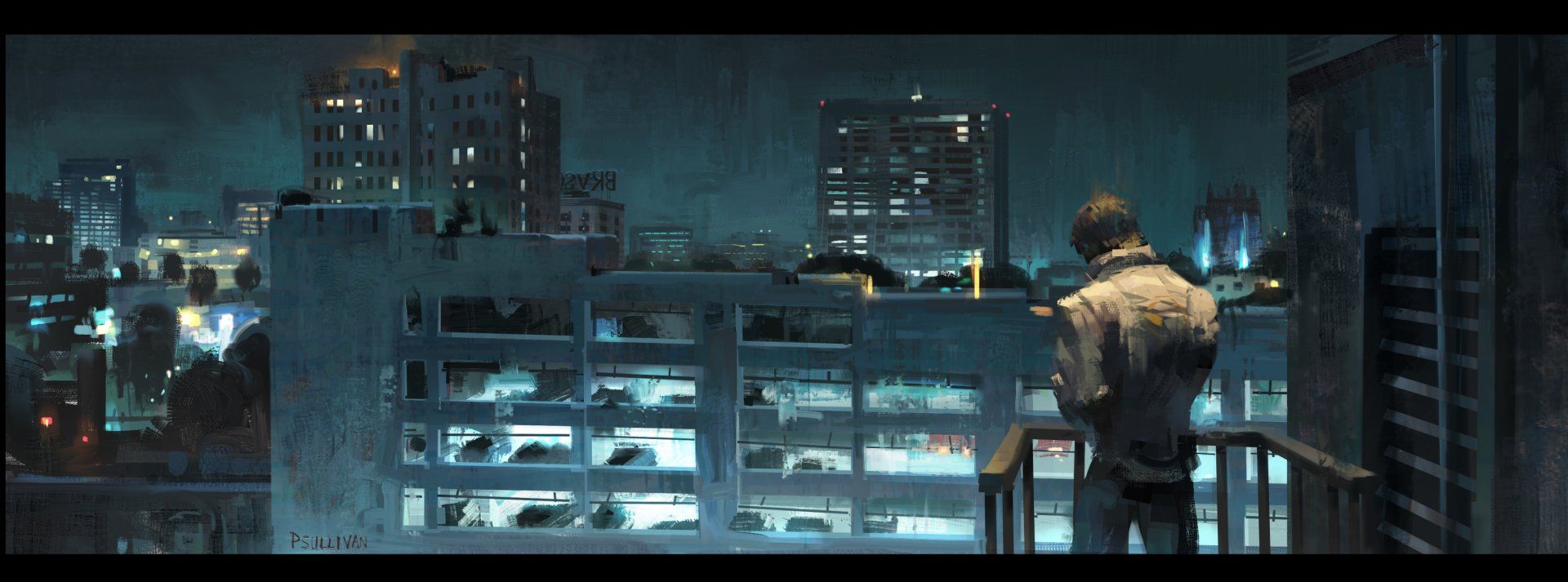
Love this film and Love Ryan Gosling in it. Such a moody dark piece and I wanted to study it and play in that world.

Some say an artists work is never done, perfect example. I never liked how I painted these designs back when I did Tomb Raider. So I wanted to redo it now. I always imagined the skin on the Viking corpses stretched and sinewy, covered in glowing goo, but this time I wanted to try it more localized on the inside of them as it was supposed to be their life force. I only spent a couple of hours on this but I like the potential of where it could go.
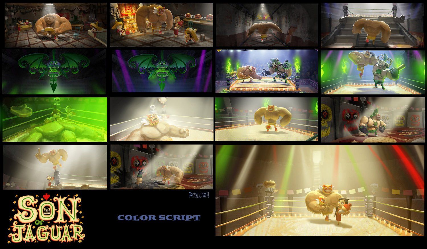
We wanted Son of Jaguar to show up as yellows and warm tones and Lord Calavera to be represented by greens. So the color script reflected this. In the story we have a battle in the ring. When lord Calavera is winning, green takes over. When SOJ starts to regain his angle on the match, the yellows and warm tones get stronger.
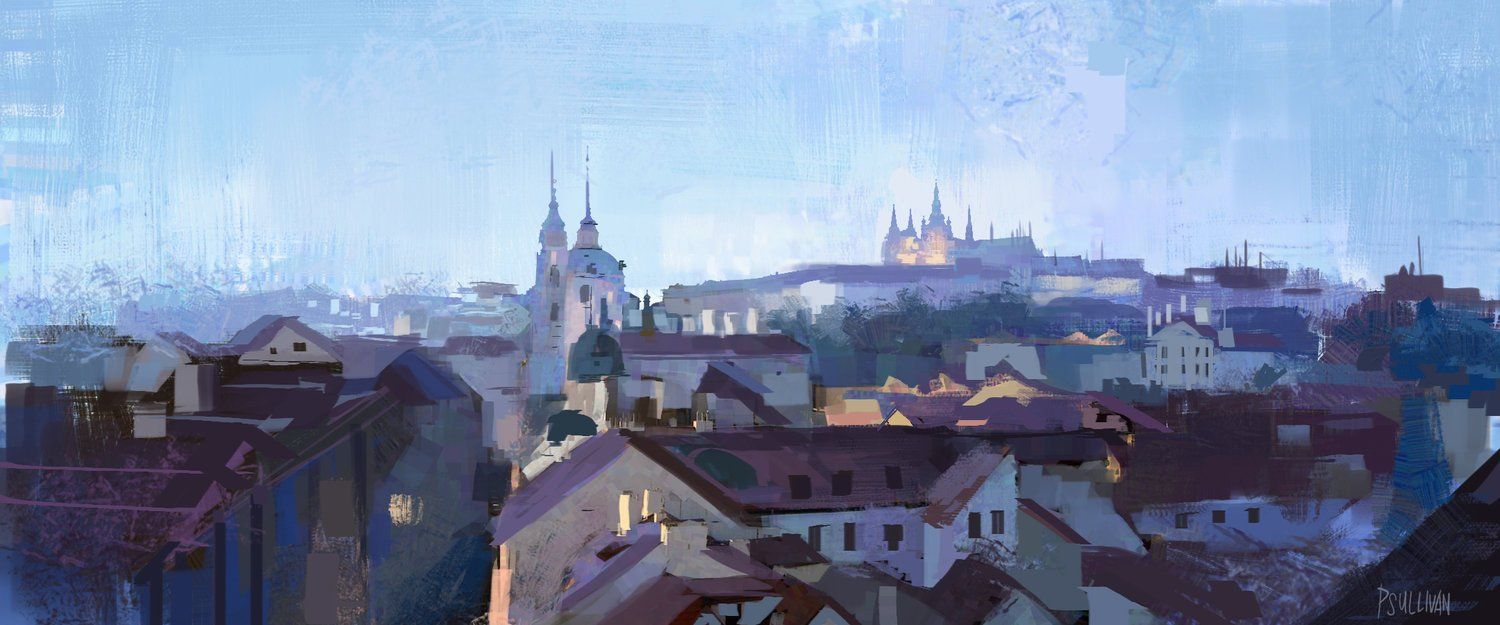
A sketch of Mala strana in Prague.
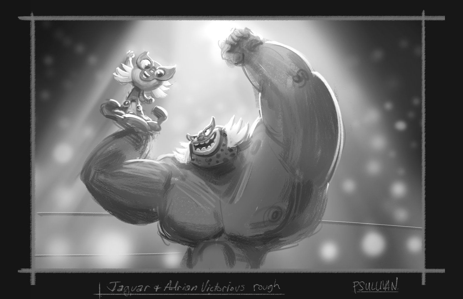
Almost 2 years before we actually made the Son of Jaguar VR short with Google spotlight stories, we did these shots for the beats of the story that Jorge was brewing up to help illustrate the ideas. As usual with these things, we had to work fast and get ideas across quickly hence the rough nature of these. I like what the spontaneity created. This thing was Jorge's idea through and through and we were just trying to help him tell his story as best we could with the new and limited medium of VR. It ha to render in real time on a phone, the google pixel 2. And one of the challenges with VR is that you can't frame compositions like we do in film, it's like a mix between a game and a film that way. But he wanted to tell a story in this medium, because why not!? There are no rules to VR and in a lot of ways it's still being pioneered which is a fun challenge. One super creative solution he had to that was to isolate the story to the inside of a ring, as if you were the viewer looking on. You could look around if you wanted to, but like a real wrestling match, you want to look at the action inside the ring. So I thought it could eb a good solution to help the viewer feel like we were inside the lights of the ring, by darkening and blurring the background, so maybe you could just see lights of cameras and the first couple rows of people in the crowd. These shots are really the first take on that idea.